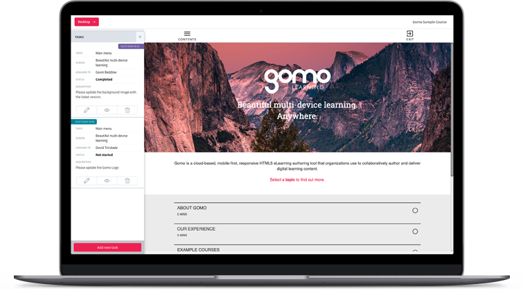
Gomo Unveils Major Authoring Tool User Interface Refresh
Available to all users immediately, Gomo Learning’s refresh of its authoring experience helps L&D professionals achieve modernized, user-friendly, and more consistent digital learning, while retaining the authoring tool’s existing features.
After extensive planning, testing and adjustments, the team behind cloud-based eLearning authoring, delivery and analytics platform Gomo Learning has launched a major revamp of all aspects of the authoring tool’s User Interface (UI). This update modernizes and standardizes Gomo’s UI, retaining the powerful features the platform is known for while placing renewed emphasis on industry-leading user experience.
Gomo launched to the public in 2014 and is a pioneer in responsive, HTML5-enabled cloud-based eLearning authoring. To bring the software more in line with expectations of today’s SaaS users, the Gomo team has been working to research and address a wide range of UI design opportunities.
“We’re immensely proud of Gomo’s new look, and are particularly excited with the firm foundation it builds for the exciting program of updates coming up in our development roadmap,” said Gomo’s Managing Director, Gavin Beddow. “The refreshed UI not only addresses a number of style and layout inconsistencies that have crept in as the product has evolved, but has also given us the opportunity to revisit and rethink our quick start wizards and other first-time visitor experiences.”
Key changes in the new Gomo Learning authoring UI include:
-
A complete refresh of all modal windows where elements have been tidied and placements rethought
-
A rework of the main editor to give it a less technical, less intimidating appearance
-
An increase in the use of images and simple animations (e.g. rollover animations)
-
A redesigned course creation wizard that will better ease in newcomers
-
A raft of newly added and rewritten orientation messages explaining the function of key screens
-
A rebranded interface aligned with current Gomo branding
-
A wide variety of tweaks to padding and positioning
“Learning professionals already familiar with the Gomo interface can rest assured that every feature accessible in the old UI is still available in the new UI,” notes Beddow. “We’re confident that veterans and newcomers alike will agree that the changes will make the process of designing and delivering digital learning easier and more intuitive. The end-result is a cleaner user interface that will help learning professionals get on with the business of creating great eLearning.”
The new UI is available to existing Gomo customers and new users can request a free trial and experience the improvements by clicking here. This option is also available to users who have previously taken the free trial and would like another look.
To support new and returning users, the Gomo team will be running a demo webinar offering a tour of key features and the new UI on Thursday, July 30: Register your interest for this demo webinar by clicking here.
/ENDS


